
Courtesy : gcf global
DESIGN and branding
Branding and visual identity are all around us. Look closely, and you’ll find them on websites, product packaging, and different types of advertising. Even personal items, like documents and business cards, bear some form of identity.
Simply put, branding is what other people think—about you, your company, your product, or your service. Visual identity is what that brand looks like, from your logo to your color choices and so much more.
Strong visuals can be very persuasive. Think of your own experiences as a consumer. Have you ever chosen a product simply because you liked the way it looked? Understanding visual identity can help you make more thoughtful design decisions, regardless of your role, medium, or skill level.
A closer look at visual identity
Visual identity is kind of like a preview of your brand. Each part of your design is a clue that tells the viewer what they can expect. Your aesthetic can be traditional, modern, or a little more out there—every brand is different. No matter what, all of your design elements work together to show exactly what your brand is about.
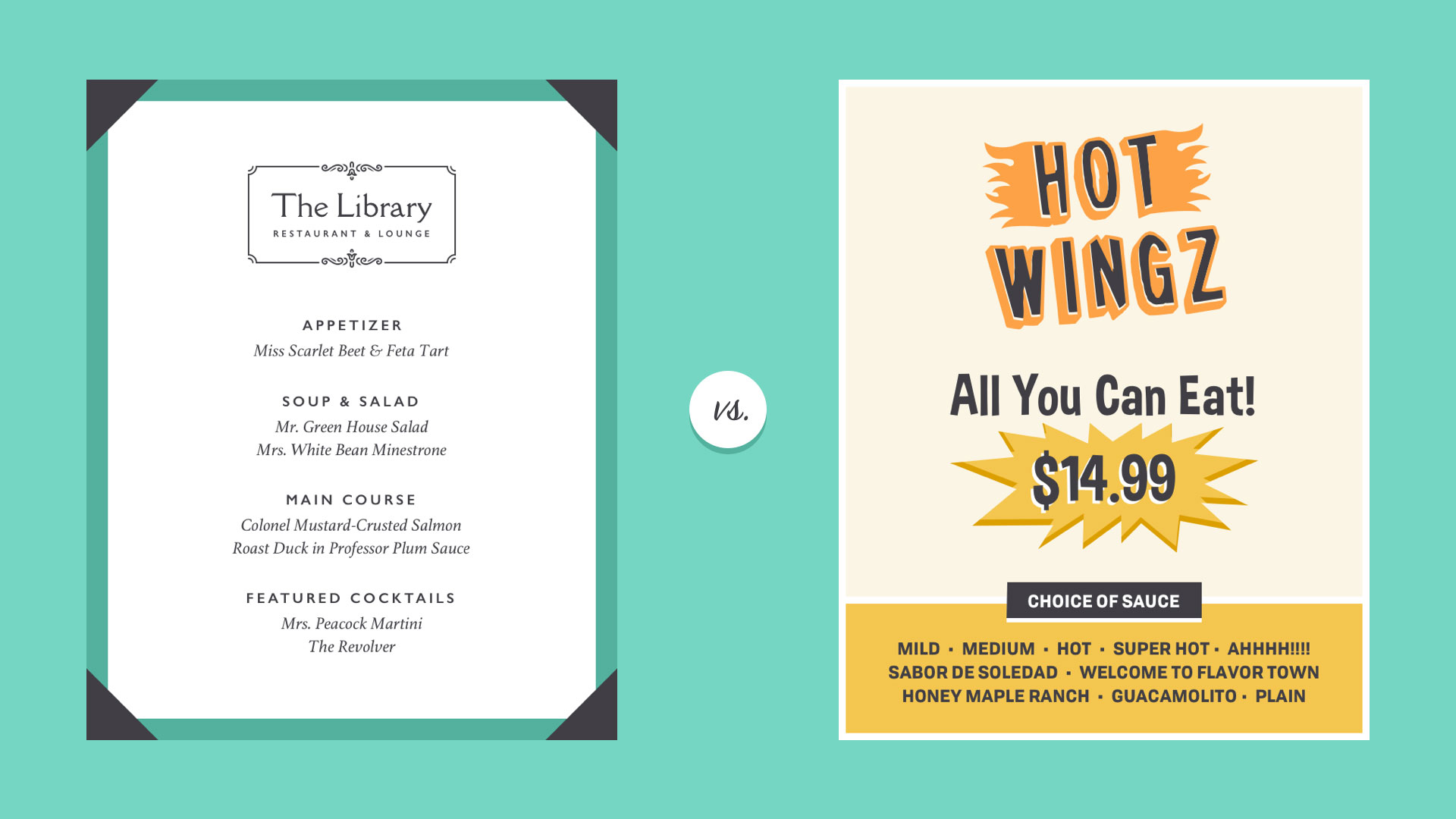
Of course, it’s not all business. You can apply the concept of identity to almost any type of project, including personal designs. Whether you’re updating your resume or looking for ways to enhance your blog, there are many benefits to having a consistent visual style.
Some companies use an actual style guide to keep their brand looking consistent. If you’re just getting started with design, it’s OK to take a more casual approach.
The main components of visual identity are logo, color, typography, and images. Read on to learn more.
Logo
A logo is what identifies your brand using a particular mark, type design, or both. The most effective logos tend to be fairly simple—something viewers will recognize and remember.
Every element of your logo contributes to your brand identity, including your font choice, colors, and other imagery. Change even one of these elements, and it can have a big impact on the way your brand is perceived.
In practice, logos are everywhere. You’ll find them in corporate settings, as well as out and about, representing small businesses, freelancers, and other entrepreneurs. A logo is a lot like a literal brand—it’s how people come to recognize you and identify your product or service.
That’s why it’s important to use it wisely. A logo that’s pixelated, distorted, or too small to read could give viewers the wrong impression. Below, you’ll find several examples of low-quality files.
To combat this, keep a master digital copy that’s sharp, high in quality, and large enough for any project. This way, you’re prepared for anything that might come along, whether it’s a small print job or something much, much bigger.
To combat this, keep a master digital copy that’s sharp, high in quality, and large enough for any project. This way, you’re prepared for anything that might come along, whether it’s a small print job or something much, much bigger.
There are lots of ways to use brand colors. Just be careful not to go overboard or ignore widely accepted design standards. Good color use is all about moderation.
Avoid common pitfalls, like colors that vibrate or distract viewers from your work. For instance, in the image below, the text clashes with the background, making it difficult to read.